

Photography
Wardrobe, light, framing and neutral-warm color grading across a photographic set.
The reference set
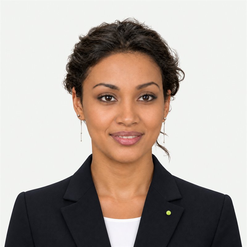
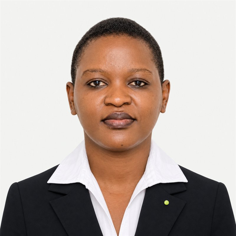
The studio reference set. Clean off-white ground, black tailoring, soft frontal light, a neutral-warm grade, and almost no colour — the lime appears once, as a pin. Photograph every team member this way: same backdrop, same lens, same head margin, one grade applied to the whole set. Compare any new portrait against these before publishing.


The five constants
Every image in the brand set shares these. If one changes, the whole set has to be reshot or regraded — which is why they are constants and not preferences.
| # | Constant | Value |
|---|---|---|
| 1 | Ground | Warm white / light grey #F4F5F2 → #ECEEE9, seamless, no visible corners |
| 2 | Wardrobe | Black or near-black tailoring + white shirt, or black tee. One lime accent maximum |
| 3 | Light | Large soft key front-left, gentle fill, catchlights visible, no hard shadow on the face |
| 4 | Framing | Eye level, 85–105mm equivalent, head + shoulders, centred, 6–8% head margin |
| 5 | Grade | Neutral-warm, faithful skin, low–medium contrast, no split-tone, no vignette |
Wardrobe
Team portraits (the standard look)
- Black blazer or jacket, white collared shirt — or a black crew tee for a lighter register.
- Accents are cues, not garments: a pin, a rule, a single word. A lime pin on the lapel is the standard cue; one per person, on the wearer's right lapel (camera left).
- Garments are obsidian, warm white or warm grey. A lime garment is the accent, so if one person wears lime, nobody else may carry lime in the same frame — no lime pin, no lime prop, no lime signage.
- No patterns, no prints, no bright colour blocks, no denim-blue or navy headline pieces, no visible brand marks from other companies.
- Jewellery: minimal.
Casual register (studio-in-action, behind-the-scenes)
- Black, charcoal, white, warm neutral. A single muted earth tone is allowed.
- Nothing fluorescent, nothing slogan-printed, no competitor logos.
Why black + white: it is the only combination that reads correctly on both the obsidian and warm-white canvases we design against, and it lets the lime pin be the one colour the eye finds.
Light
- One large soft source, front-left, roughly 45°, feathered — a 120cm softbox or a window with diffusion.
- Fill from camera right at ~1 stop under the key. Shadows stay open and clean.
- Catchlights in both eyes at roughly 10–11 o'clock.
- Background lit ½–1 stop above the subject so the ground stays warm white, not grey mud.
- Absolutely no: bare on-camera flash, hard noon sun, coloured gels, practical neon, rim-light halos.
Framing
| Property | Value |
|---|---|
| Lens | 85–105mm full-frame equivalent (no wide-angle faces) |
| Aperture | f/4–f/5.6 for a set (consistent depth of field across everyone) |
| Height | Lens at eye level — never looking down on the subject |
| Crop | Head + shoulders; crown at 6–8% from the top; eyes at ~40% from the top |
| Horizon | Level; no dutch angles |
| Deliver | 1:1 master + 4:5 for cards |
Chest-up, not passport. A little shoulder and collar keeps it human.
Colour grade
The target is "warm neutral": it should look like the room was pleasant, not like a filter was applied.
| Control | Setting |
|---|---|
| White balance | +150 to +300 K warmer than neutral; no green or magenta cast |
| Contrast | Low–medium; blacks lifted slightly (not crushed) |
| Highlights | Not clipped — shirt detail stays |
| Shadows | Open; detail visible in black fabric (black should not read as a void) |
| Saturation | Natural; skin slightly under-saturated rather than punchy |
| Skin | Faithful across all tones; no orange push on darker skin, no Pink/Orange on lighter |
| Split toning | None. No teal shadows, no orange highlights |
| Clarity / texture | Moderate — enough for fabric texture, no HDR crunch |
| Grain | None, or very fine and uniform |
| Vignette | None |
| Sharpening | Portrait-appropriate; no halos against the light ground |
The five-second test: hold the image next to the reference set. If skin looks cooler, flatter, or more saturated than the reference, it is wrong.
Consistency across a set
Sets matter more than singles. An inconsistent portrait is worse than a plain one.
- Shoot everyone in one session on the same backdrop, light and lens.
- One grade, applied to all files — a single preset or LUT, not per-image judgement.
- Same crop, same head margin, same background tone.
- If a person cannot be in the session, match them to the set deliberately: shoot against the same ground, then grade to the reference, and check side by side.
Set checklist
- Same background tone across all files (sample the pixel, don't eyeball it)
- Same head margin and eye line
- Same lens / depth of field / crop
- Same grade — no individual "improvements"
- Lime pin present and on the same lapel in every shot
- 1:1 and 4:5 crops exported
Studio & mockup scenes
The messy-studio rule still holds — real desks, real cables, real paper — but the grade is the same neutral-warm, and the palette stays obsidian / warm white / one lime note.
- Keep one horizontal anchor (desk edge, shelf, window line).
- Let the frame breathe; one subject, one gesture.
- No glossy showroom setups, no blue-hour neon, no fake sunlight beams, no HDR.
- Screens show our work or an abstract block — never invented client logos or fake UI.
Never
- Teal-and-orange grading, heavy vignettes, HDR, or "AI look" (over-smooth skin, plastic highlights, impossible bokeh, six fingers).
- Cool/blue-grey grade — it reads gloomy and off-brand.
- Coloured gels, neon, lens flare, light leaks.
- Synthetically generated faces presented as team members.
- Logos of other companies, or invented Creative Yadley marks inside an image.
- Wordmark rendered by an image model — the name is set in Jakarta as live text.